Fuegokit — Design System at Appfire
Appfire makes plugins for Atlassian, monday.com, and other platforms. I joined the design system team to help implement a token language that can adapt to any ecosystem and to maintain our component libraries. Here are some of my contributions:
- Documenting tokens
- Creating, maintaining, and cleaning up Figma libraries
- Improving handoff with Figma-to-code connection
- Extending the system to represent Appfire's identity
- Developing a content review plugin
- Designing content guidelines documentation
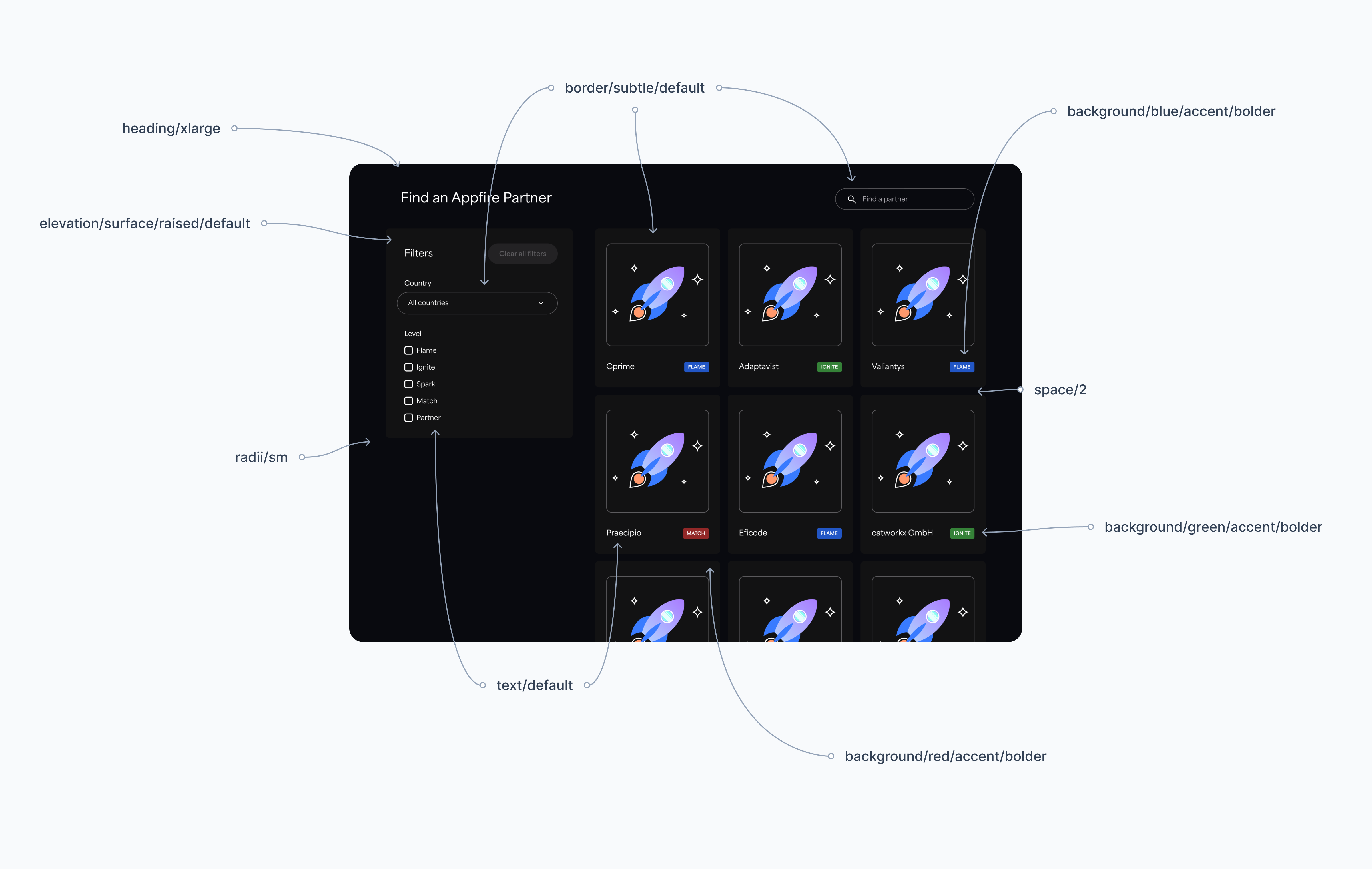
Documenting tokens
Challenge
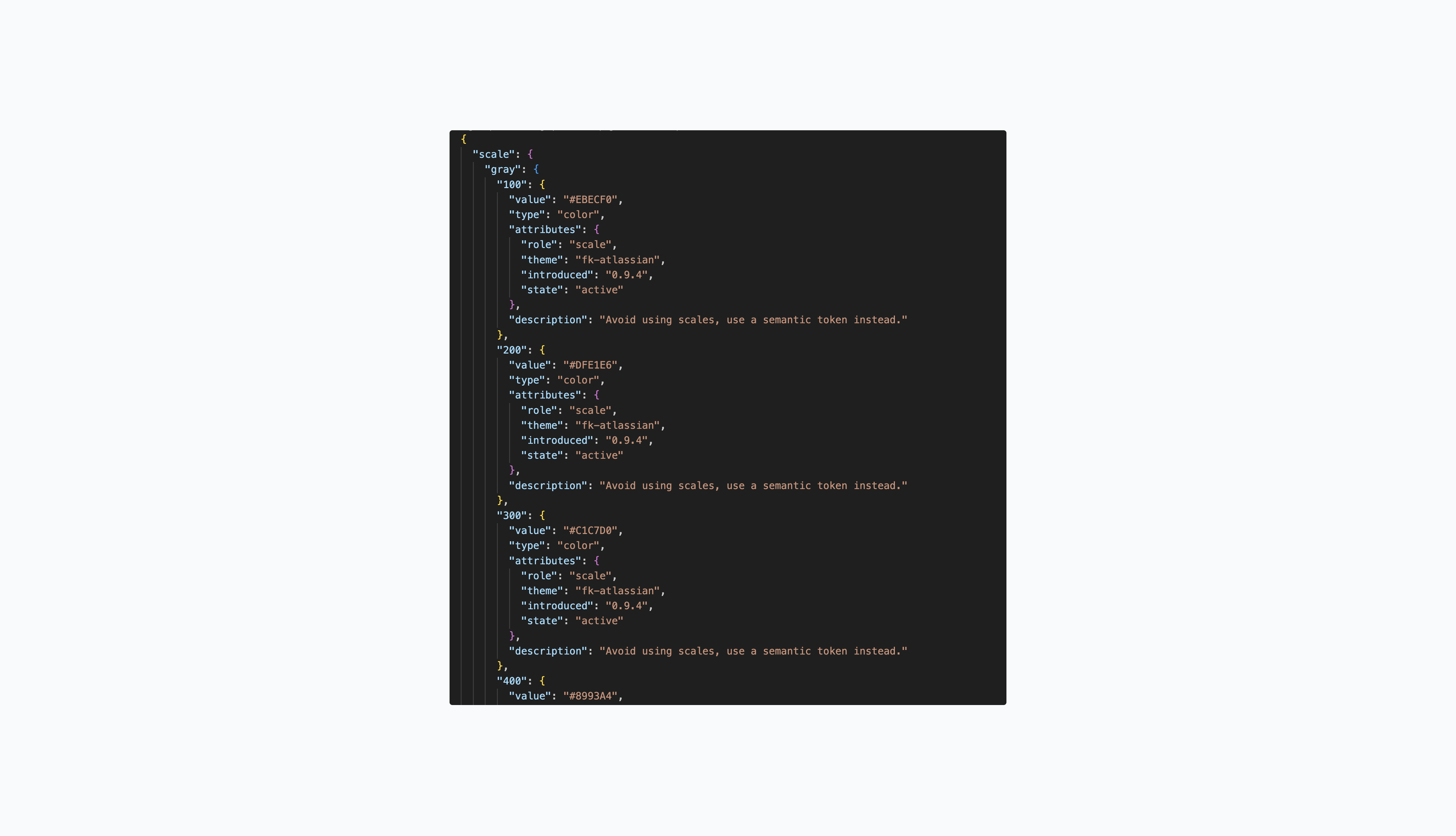
When I joined, we already had a scalable token structure and well-defined naming conventions. However, there wasn’t a convenient way to view or search through all the existing tokens.
My contribution
I created searchable token tables within our documentation. This made it easier for everyone—especially designers and product managers—to find and explore tokens. The documentation is connected to our tokens repository, so the information is always up-to-date.
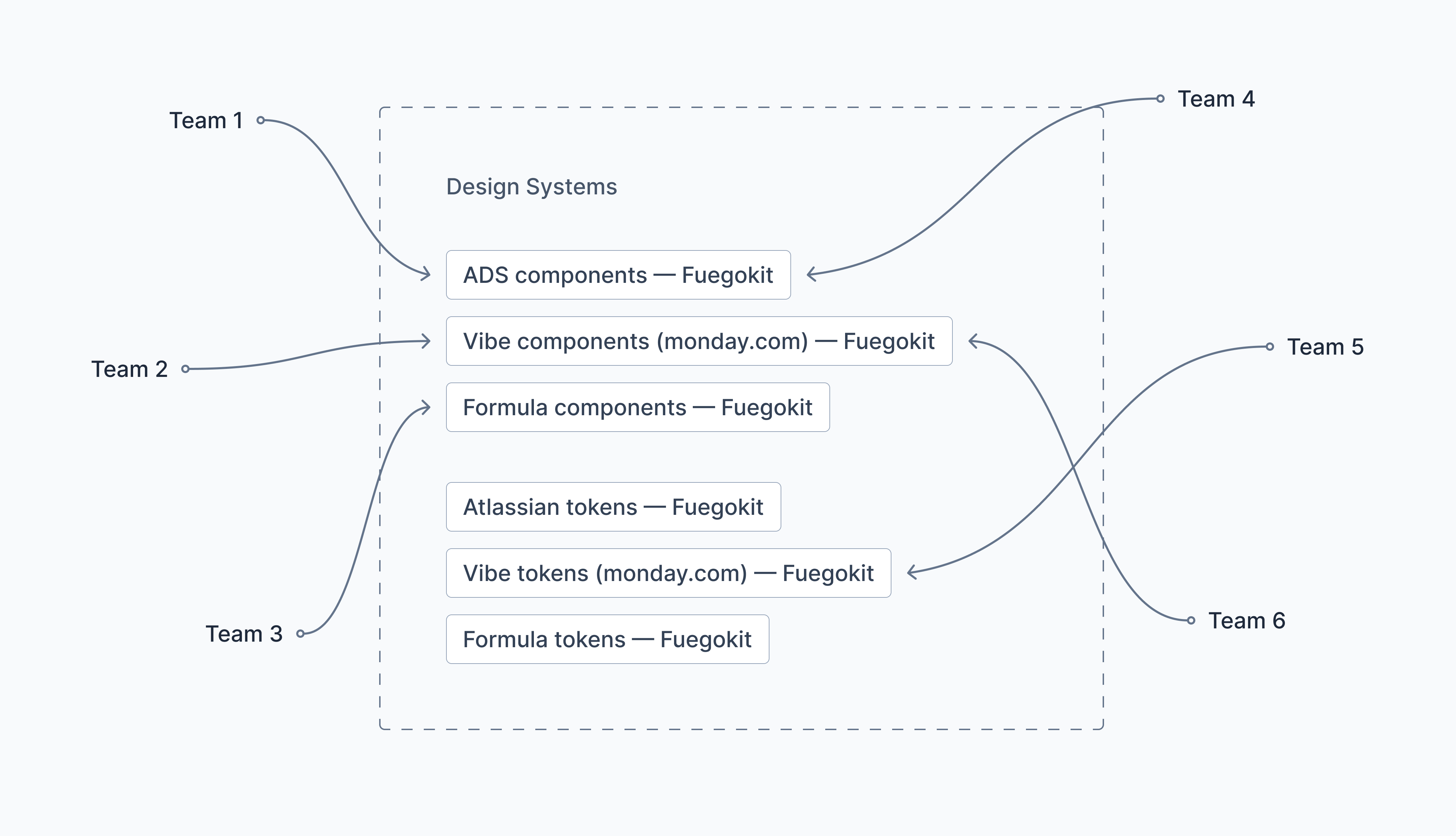
Creating, maintaining, and cleaning up Figma libraries
Challenge
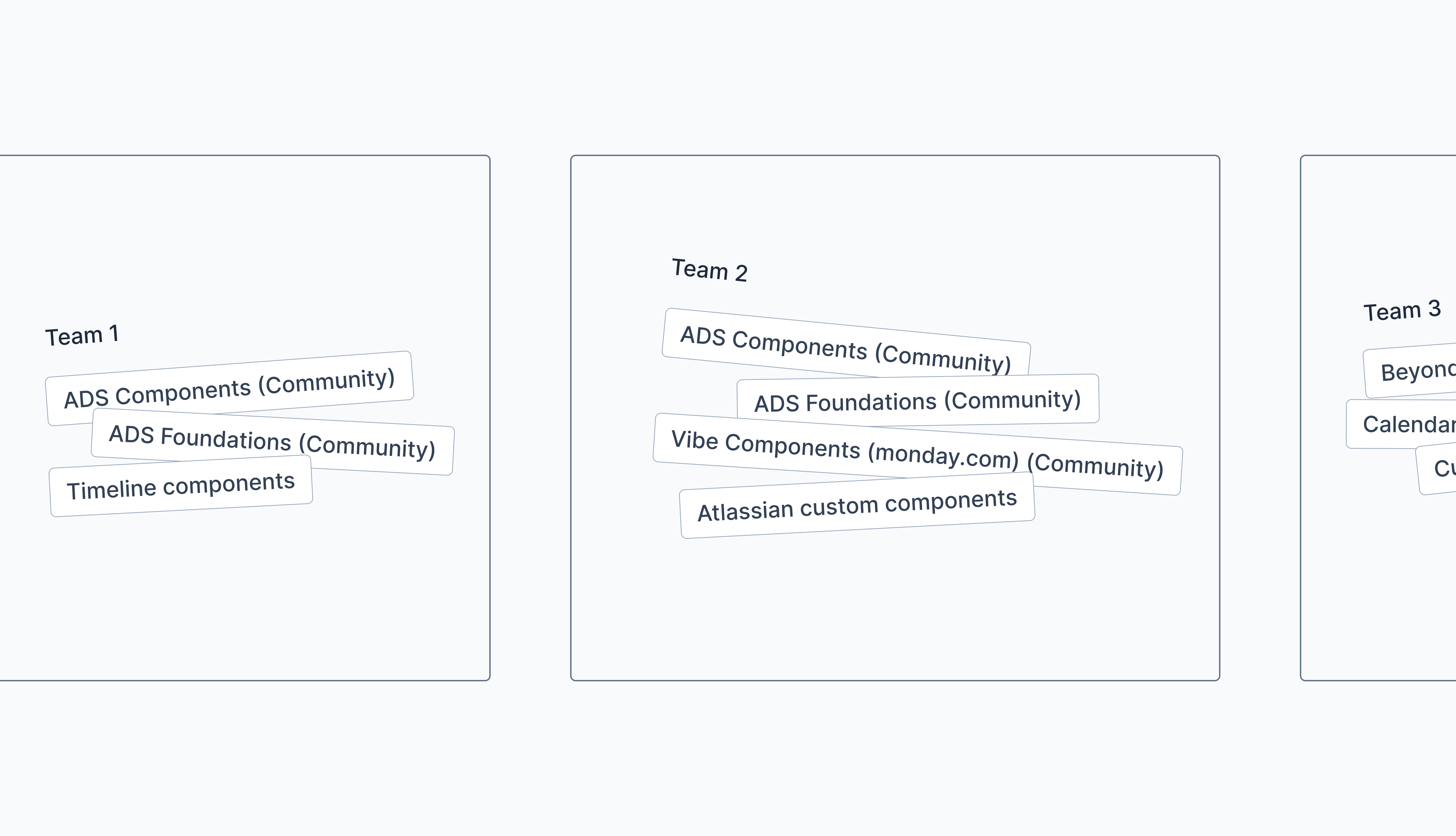
When I joined, we didn't have centralized component libraries set up in Figma. Instead, there were over 50 published libraries spread across different teams, many of which were outdated or duplicate community files. We also didn't have our tokens set up in Figma.
My contribution
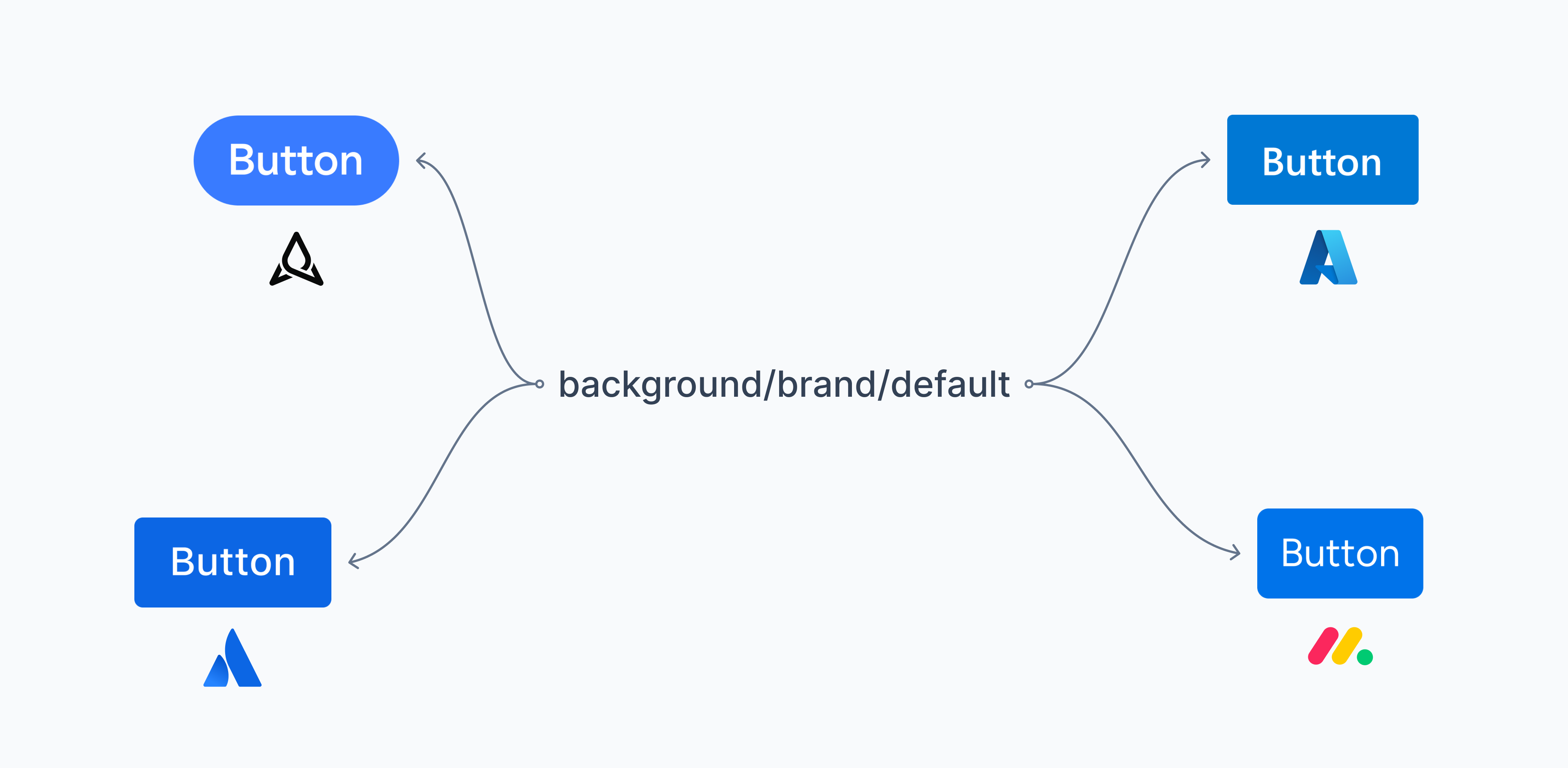
I downsized the number of our libraries from 50 to 12, rebuilt component libraries for the three main ecosystems (Atlassian, monday.com, and Formula), and set up style libraries for our tokens.
When Figma released variables, I lead the migration which went smoothly and with zero disruptions to teams.
Improving handoff with Figma-to-code connection
Challenge
The lack of integration between Figma and code made it harder for engineers to adopt the design system, as they frequently had to check documentation to search for tokens and components.
My contribution
After setting up our tokens and components in Figma, I connected them to our codebase. This created a more frictionless experience for engineers, allowing them to easily access the correct token names and component props without the need for constant documentation checks.
Extending the system to represent Appfire's identity
Challenge
At its inception, Appfire didn't have its own visual identity because it wasn't necessary—after all, our products existed within other ecosystems. However, soon after I joined, the company invested into redesigning our marketing website and expanded its business strategy to include developing our own products.
The implementation of these products needed to remain compatible with other ecosystems while also aligning with the direction set by the Creative team.
My contribution
My part of the project was mapping the Creative team's colors and typography to our token system and then setting up token, component, and illustration libraries in Figma.
Developing a content review plugin
Challenge
Many of our own product names and common terms were constantly misspelled.
My contribution
Our UX writer, Magda, and I collaborated to create a Figma plugin called Appfire Content Check. This plugin functions like a standard spell-checker but is tailored to our specific terms. It allowed designers and product managers to follow our guidelines seamlessly, without needing to reference external documentation.
Designing content guidelines documentation
Challenge
There were no centralized writing guidelines, resulting in frequent inconsistencies in voice and tone.
My contribution
Magda and I also collaborated on creating a dedicated space for content guidelines within our documentation. I focused on styling the layout and refining relevant React components to enhance visual polish, improve code clarity, and ensure accessibility.
You made it!
How about exploring another case study or checking out one of my side projects?